…Avenir Next. It looks like this:
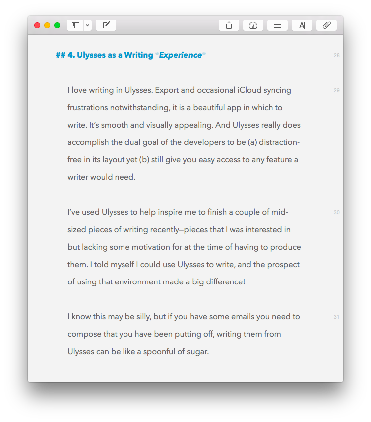
(That’s Ulysses, my new favorite writing app.)
Avenir is a pretty smooth font, too:

Adrian Frutiger designed them both. You can read more about the Avenir font family here.
…Avenir Next. It looks like this:
(That’s Ulysses, my new favorite writing app.)
Avenir is a pretty smooth font, too:
Adrian Frutiger designed them both. You can read more about the Avenir font family here.


But don’t serifs help your eyes to track along the text, making for a smoother reading experience?
>
I hadn’t paid much attention, but I suppose so.