Now Reading: How to Break Up With Your Phone

3d+Book+Cover+HTBUWYP+jpgYes, the book you’ve always wanted to read (and that I was starting to write!) is now available: How to Break Up With Your Phone, by Catherine Price.

Despite the book’s title, Price teaches us not how to break up with our phones per se, but how to renegotiate the relationship–which requires a break of sorts, at least at the outset.

I’ve just finished the first part, where she builds a compelling (and alarming) case for limiting screen use. Part Two is the “how-to,” which I’ll share more about later.

I learned about the book from a New York Times piece of hers. It’s relatable from the very beginning:

The moment I realized I needed to break up with my phone came just over two years ago. I had recently had a baby and was feeding her in a darkened room as she cuddled on my lap. It was an intimate, tender moment — except for one detail. She was gazing at me … and I was on eBay, scrolling through listings for Victorian-era doorknobs.

We all have our “Victorian-era doorknobs.” And, until users rightly started jumping ship this last week, Facebook.

Many of us will nod our way through the book’s description:

Is your phone the first thing you reach for in the morning and the last thing you touch before bed? Do you frequently pick it up “just to check,” only to look up forty-five minutes later wondering where the time has gone? Do you say you want to spend less time on your phone—but have no idea how to do so without giving it up completely? If so, this book is your solution.

Check out the book here. Ten Speed Press has been kind to send me a review copy, so I’ll write more about it when I’m done, but I already know this is the rare book I’ll re-read once a year.

Review of TomTom Spark Cardio + Music Fitness Watch

It’s by no means the most advanced or visually appealing fitness watch on the market, but if you want to track the basics of running—and listen to music!—the TomTom Spark Cardio + Music watch is a great option.

I was able to get my hands on a cheap previous generation TomTom Spark Cardio + Music. The watch has now been updated to the Spark 3, which I’ll talk more about at the end of this review. The model I’ve used (apparently now the “Spark 2”, or just “Spark”) and the Spark 3 have quite a bit in common, though.


What It Looks Like


This is what the Spark looks like:


Unlike Garmin models, you can’t install (or even select pre-installed) alternative watch faces. More options would have been nice. But the watch looks pretty good:


The watch band clips together in three different spots, using a clasp mechanism I haven’t seen in any watch (fitness or otherwise) before. (The green in the photo below is the light from the wrist-based heart rate sensor.) At first I didn’t like the clasps, but the security of the band (and ease of putting it on and taking it off) caused the mechanism to grow on me.


Activity Tracking


Let’s jump right in with an activity. You can select one from the watch’s profile:


You can select various kinds of runs.


The TomTom does great with these options—I tried goals (distance, pace, etc.) and intervals, where it really shines. You can set up the intervals how you want: warm-up, work, recovery (“rest”), number of sets, and cooldown.


With your workout selected (use “none” to just get going), you wait for the watch to acquire a GPS signal. It’s not as quick as a Garmin on this front, but it’s still pretty fast (less than 30 seconds), with rare exceptions. Once you’ve got a signal, it tells you to get going. If you’ve got Bluetooth earbuds in, you’ll get an audio cue, too.


As you can see in the photos above, underneath the watch is a big plastic square, around which is a button that you press (up, right, down, or left) to make your way through the various watch menus. The TomTom is not a touch screen, and unlike other non-touch watches, its buttons are not on the side.

This looks awkward, but I got used to it fairly quickly. Not having a touch screen is actually really nice mid-sweaty run, where touch screens are harder to operate.

During an activity you can view three metrics at a time, and press up or down to see more. There is some customizability here, but the bottom two fields (the font of which is a little too small) remain the same while only the larger data field adjusts. It would be nice if TomTom would allow all three data fields to change at a time.


After an activity you can see your results, though getting to results is not immediately evident—you finish your activity by pressing left twice (once to pause, once to stop), then have to go into the new activity screen and press up to see past results. Results look like this:


The basics are there, but a big miss is the inability to see splits or interval time as soon as you finish a run. You can find this on the accompanying mobile app (which looks great; more below), but most of us will want this info right away before we get home to sync with phones.

The TomTom tracks steps:


You have to press left to see your steps, and there’s an animation to wait through. This would be good to streamline in future versions, or even put steps on the first screen.


The battery life is pretty good, even using GPS and listening to music, though I was bummed that a nearly fully-charged TomTom died mid-run when I went out 10+ miles in the woods—maybe because the GPS signal was working extra hard?

Treadmill workouts are possible—like the Garmins I’ve tried the distance and pace are inaccurate, but unlike the Garmin watches, TomTom allows you to adjust the distance after you finish a workout. This is great!


The “Cardio” version also adds wrist-based heart tracking, which others have noted is especially accurate (as wrist-based HR goes) with TomTom.


The TomTom Mobile App


TomTom’s mobile app (“TomTom Sports”) looks much better than Garmin’s Connect app.

There are two frustrating pieces to it, though: (1) A “Waiting for watch” message greets you every time you open the app. Unlike Garmin’s app, there is no syncing until you press down on the watch. Every time. (2) Every single time I open the app I have to dismiss (and dismiss again… and again…) a box that asks me to share anonymous data with TomTom. I like TomTom, but really don’t want to share that data… and would like to not be asked every time I’m in the app.

Other than that the Sports app is pretty good. There’s even an accompanying Website that shows you more watch-generated info.

You can see tracked sleep, steps, and activities. TomTom is very near to rolling out an update that gives you “fitness age” and VO2 max—a serious upgrade even to the older model watches! This is a generous move on TomTom’s part.

Here’s what the mobile Sports app looks like:


(The sleep tracking is not always accurate, as you can see.)


Music, Music, Music!


It is hard to adequately describe how awesome it is to use Bluetooth-enabled earbuds to sync to the watch and listen to music. That’s right—no phone. Just wireless earbuds, the watch, music, and the open road. That alone makes the TomTom Spark worth considering as one’s go-to running watch.

Syncing with earbuds is easy. Others have described the music upload system as clunky, but it’s not so bad. Once you’ve got mp3s in iTunes, you just create a playlist, which you then move over to the watch through the desktop app. You can control the music through the watch buttons or whatever controls are on your Bluetooth earbuds.

As I mentioned, for this review, TomTom did not provide me with a sample—I purchased one, though I ended up returning it because of a slow-to-respond (or sometimes unresponsive) menu button that led me to believe I’d received a defective unit. I have been using a cheap, used Garmin in the meantime, but I miss the TomTom’s music already! It’s beyond me why more fitness watches don’t also include music.


What’s New in the Spark3


If I can get my hands on a Spark 3, I’ll write about it again here. In the meantime, here’s what the Spark 3 adds that the above model doesn’t have:

  • route exploration (you can see where you are and how to get back to your starting point)
  • compass
  • capacity to upload pre-set routes and follow them on the watch
  • slight tweak to the wristband

See this Amazon review for more (including TomTom’s response).

Whether you go with a discounted Spark 2 or the newer Spark 3 with its “bread crumb” navigation, the TomTom watch is a solid option for runners, especially ones who want music on their runs.

You can check out the Spark 2 here at Amazon (sale units are at TomTom). Find the Spark 3 options here (TomTom) and here (Amazon).

What’s New in the Garmin Vívoactive 3


Screenshot 2017-08-30 16.27.55
Image via Garmin Vívoactive 3 Manual


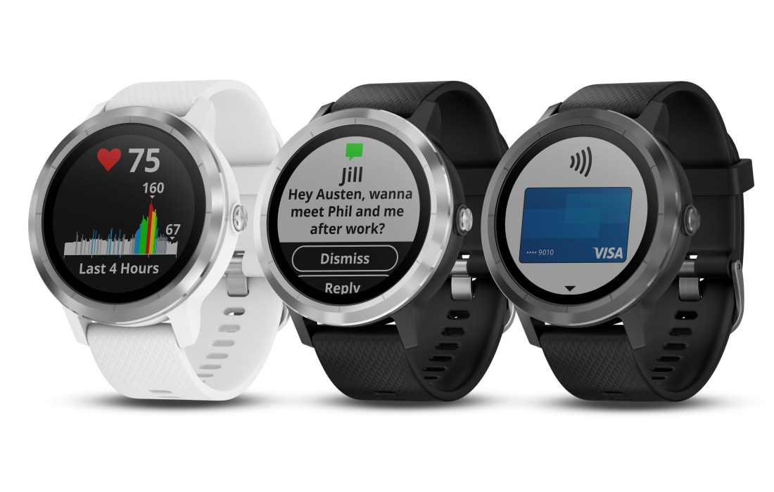
Garmin has not yet announced their new Vívoactive 3 smartwatch, but Dave Zatz today pointed out a link to a full PDF of the Vívoactive 3 PDF manual. (Here; link active at time of posting.)

Tech site SlashGear picked up one major new feature: the addition of Garmin Pay, which enables you to make credit or debit card payments from your watch.

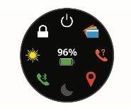
For those of us who are more interested in the fitness aspects of the watch, here are some highlights I picked up from reading through the user manual—I’m sure Garmin will make their own official announcement this week.

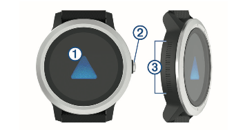
The Vívoactive 3 is a touchscreen device. But there’s also something I’ve never seen on a watch before: what Garmin is calling “Side Swipe Control,” a grooved, touch-sensitive area on the side/body of the watch. (Number 3 in image below.)


Screenshot 2017-08-30 16.08.12
Image via Garmin Vívoactive 3 Manual


It’s a great idea, especially since touch screens are notoriously difficult to navigate mid-sweaty workout. By contrast, the Side Swipe Control allows you to “slide up or down along the textured area to scroll through widgets, data screens, and menus.”

You can navigate widgets, data screens, and menus via touchscreen, too, but having this additional way to do it seems to be one of the major contributions this watch makes.

Here are some other new features, compared to previous Vívoactive models:

  • VO2 Max estimates (“on the device, your VO2 max. estimate appears as a number, description, and level on the gauge”)
  • a new “stress level” metric (based on daily heart rate variability)
  • ability to calibrate treadmill distance—I don’t remember previous Vívoactives having this, but it’s welcome addition, since the Vívoactive HR (now called “Vívoactive 2”) was quite inaccurate on treadmill activities
  • ability to view personal records from the watch itself
  • use of GPS to mark and save a location, then navigate back to it (the TomTom Spark 3 has this, but now it’s on a Garmin—cool!)
  • compass “with automatic calibration”
  • customizable watch faces, so you can select which data fields display

It’s still the multi-sport, activity tracking, wrist-based heart rate monitor watch the previous models were. Steps are counted, sleep is tracked, weather is displayed, move alerts remind you to get up when you’ve been sitting an hour, and more.

Screenshot 2017-08-30 16.08.17
Image via Garmin Vívoactive 3 Manual

If you were hoping that the Vívoactive 3 would add stand-alone music playing, the manual does not suggest that capability.

I used the Vívoactive HR for a while, but ended up returning it. The watch itself was good, but the Bluetooth connection kept dropping, the weather was consistently a few hours or days off, and the rectangular look was a little unpleasant. The Vívoactive 3 is certainly more aesthetically pleasing than previous models!

No idea what the price point will be, but I’ll post again when release is official.

Review: UE Boom 2 Bluetooth Speaker

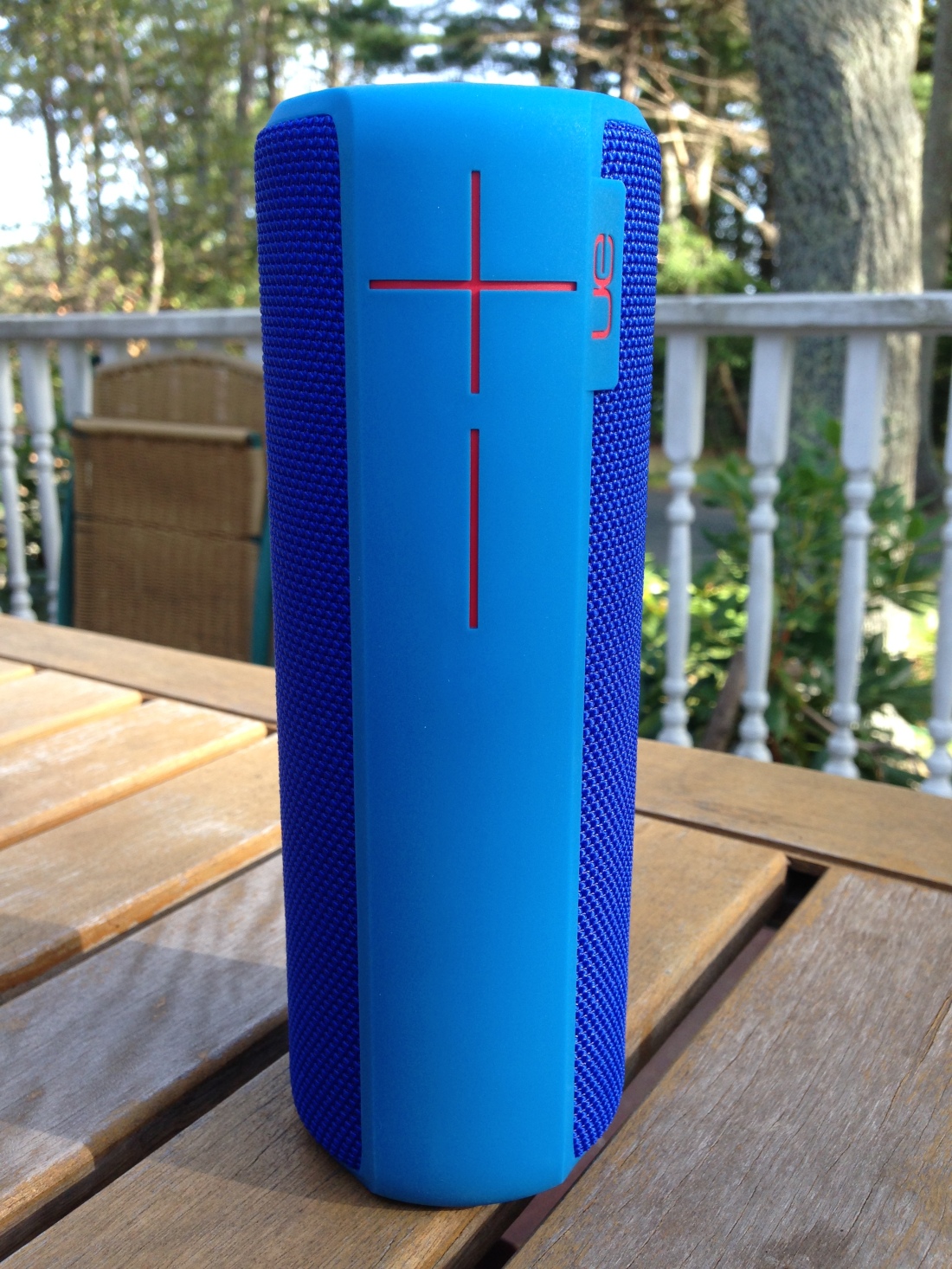
Ultimate Ears (owned by Logitech) makes a great-sounding, sleek-lookin’ Bluetooth speaker: the UE Boom 2, now in its second generation.


The Look


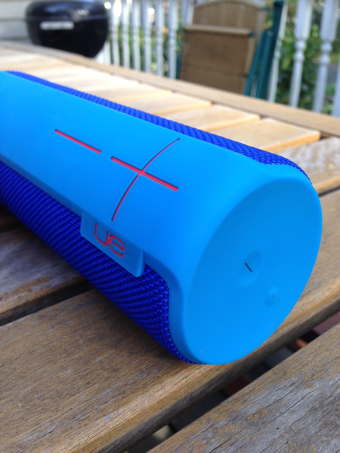
The cylindrical shape and design are very cool:


2_Standing Up Volume Buttons


The speaker is meant to be used standing up, but you can also lay it on its side without it rolling away:


3_On Side


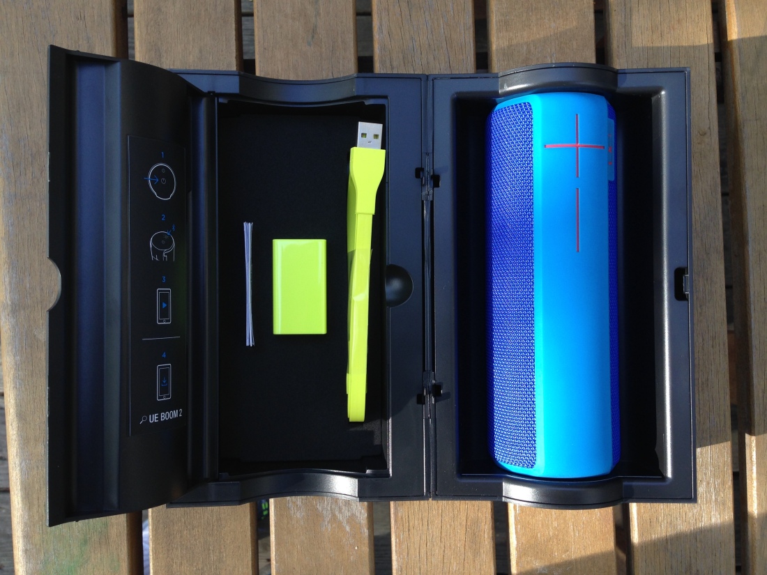
The UE Boom 2 comes in a box that looks like one of those little bank deposit tubes from days gone by:


1_In the Box


Those volume buttons are HUGE, especially compared to the smaller power on/off and Bluetooth buttons. But it’s a good look. Besides that, you can control the sound just from the volume buttons on the side of your connected device. (Pressing both speaker buttons at the same time will have the speaker tell you what percentage of battery life remains.)


The Sound


The Boom 2 has great sound, even with flat EQ. The bass is nice and clear. At a price point of just under $200, you’d expect decent sound, and this speaker does not disappoint in that regard. I didn’t measure decibels, but it can fill a whole floor of a house with music, despite its being barely taller than seven inches. Podcasts and NPR both sound great on the Boom.

The battery lasts for ages (officially rated at 15 hours), and the speaker turns itself off after a period of inactivity–which you know because a cool, little drum riff sound indicates that the speaker is powering down. Nice touch!

One down side is that the speaker won’t play when the battery is depleted, even when it’s plugged in and first charging. I found this counter-intuitive and frustrating–in other words, if you use the battery long enough, you won’t be able to listen and charge at the same time, at least not right away.

It seems also to be a design flaw that the charger port is on the bottom of the speaker. The cord protrudes such that you have to flip the speaker upside-down to keep it upright when it’s charging. This doesn’t, from what I could tell, affect the sound, however. Once you do charge it, it’s back to full power in just a couple hours.


The Use


The UE Boom 2 is waterproof (not just water-resistant). UE claims it “can be immersed in water up to 1m for up to 30 minutes.” I was not about to try this, but I do regularly–with no worries–have the speaker playing on the window sill just above the kitchen sink, while I do dishes. You don’t want to shower with this thing, but you probably could and be okay! (Disclaimer: Words on the Word is in no way responsible if you try and it goes badly for you.)
 

Bluetooth

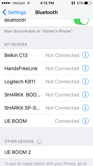
Initial pairing between speaker and Bluetooth-enabled device (phone, tablet, computer) is a breeze.


4_Connecting via Bluetooth


The tech specs for the Boom 2 say the mobile range (for maintaining the Bluetooth connection between speaker and device) is 100 feet. That was not even close to my experience–even on one floor of a house with no shut doors, at 50 feet I would occasionally notice the stream starting to cut out.

If you forget your phone is connected to the speakers and you walk out of range, there is an auto-stop feature so that you don’t lose your place in the album you’re listening too. I found this really handy.

The Bluetooth connection gets a little dicier if you’ve connected more than two devices to the speaker (i.e., ever). For the most part, though, the Bluetooth pairing process works well.


App

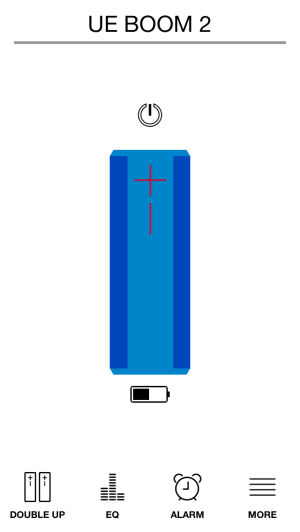
There is an accompanying UE Boom app–it’s simple, but it greatly enhances the user experience.

You can see a speaker battery life icon on your phone, right next to your phone battery percentage indicator.

And you can use the app to power off (and on!) the speaker. This wowed me. The app also has EQ settings you can adjust.


Battery life indicator, and other options via the app


You can use this bad boy as a speaker phone, though trying to use Siri or place phone calls in conjunction with the speaker is pretty frustrating, unless you happen to be right next to the speaker.

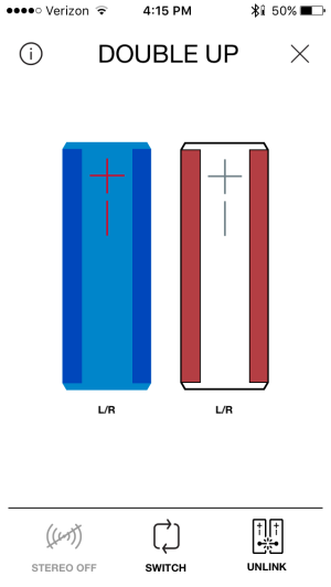
Perhaps the coolest feature is that you can “Double Up” to link two UE Boom speakers to each other via Bluetooth.


6_Double Up


This is beyond cool, and I set it up (with little effort required) the second I figured out you could do it–I listened in (loud) surround sound.


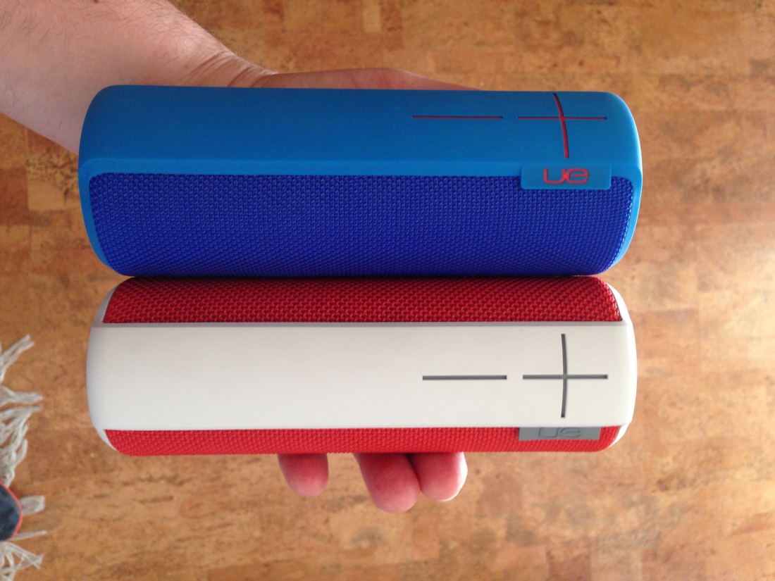
7_Boom 1 and 2


Where to Get It


The UE Boom 2 is maybe a little pricey, and it’s not without its downsides, but all in all you get your dollar’s worth. Especially impressive are the Boom’s high portability, accompanying app, general ease of use, and good sound quality.

You can find the UE Boom 2 at Amazon, or at the Ultimate Ears site.


Thanks to the good folks at UE/Logitech for sending me the Boom 2 (and, previously, Boom 1) for the purposes of the review. Their kindness in sending the samples did not, as you can probably tell, keep me from honest and objective assessment in my review.

Review: HEX Century Icon Folio for iPad Air 2

Last month I reviewed an iPad Air 2 case from KAVAJ and said:

As with iPad Mini cases, there are a lot on the market–so many that one could easily get lost in the three-hour rabbit hole of trying to find just the right one.

I’m not sure I have found just the right one for the iPad Air 2. There are a couple that are close–I’ll share about those in due course.

One of the cases that is close to being just right is the Century Icon Folio for iPad Air 2, from HEX Products.


What I Like About the Icon Folio


It’s not all leather, but the external material is primarily waxed canvas of high quality. The casing around the iPad itself is hard rubber. The HEX case strikes a neat balance of professional, classy, and casual.


Front


Back


The cut-outs for volume buttons, headphone jack, and camera are 100% A++.


Hole Cut-Outs


It’s a slim case, which makes it a good one for pulling in and out of a satchel a lot. It doesn’t add any bulk to the iPad.

You’ll have seen in the images above the elastic strap–you can use this to secure the bi-fold case, so that it doesn’t inadvertently open in your bag. The strap is thick and has the perfect amount of tension.

A key feature of the folio is the inside compartment where you can put three cards, cash, and a few notes, as you like:


Left Inside Card Slots


You can squeeze enough in here that you could take literally just this case and its contents to your favorite working spot (if you didn’t need an external keyboard).


Open


What I Don’t Like About the Icon Folio


Just two minor critiques to offer:

1. There’s no mechanism whereby you can make the case stand or prop up. In other words, the front of the case doesn’t fold as other cases do, for when you want to sit your device on a table and watch something or use an external keyboard with it.

2. After only a little use, part of the (faux?) leather strip on the side was starting to separate from the hard rubber. Nothing major, but one does hope this doesn’t worsen with time, especially given that this is not an off-brand, $20 option.


Bonus Feature, and Where to Get It


Bonus feature: though I haven’t seen HEX advertise it anywhere for this case, it does have a sleep/wake feature, so that when you close the case with the iPad on, it puts the screen to sleep automatically to save battery. This functions as it should consistently.

You can learn more about the HEX case at their Website here. And it’s available on Amazon here.


The kind folks at HEX provided me the case for the review, without expectation as to my review’s content.

Review: KAVAJ iPad Air 2 Leather Case


Image via KAVAJ (all others my own)


If I’m not mistaken, this is the first iPad Air 2 case I’ve reviewed at Words on the Word. As with iPad Mini cases, there are a lot on the market–so many that one could easily get lost in the three-hour rabbit hole of trying to find just the right one.

I’m not sure I have found just the right one for the iPad Air 2. There are a couple that are close–I’ll share about those in due course.

In this post I review the KAVAJ iPad Air 2 “Hamburg” leather case in cognac/brown.


What’s Great About the KAVAJ Case


This is an ephemeral satisfaction, but the packaging in which KAVAJ sent the case was as classy as the case itself:


2_Packaging


I really like the leather look and feel (and, of course, smell) of the case. (Current WordPress technology does not yet permit me to upload the smell to the blog.)

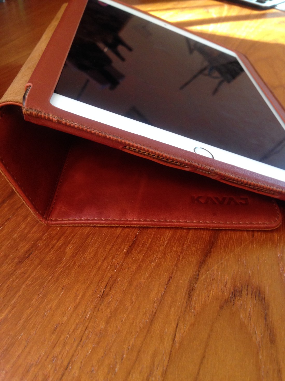
The stand system is secure and allows you to put the iPad at just about any angle you want. This is the best part about the case, as some others give you just two options, neither of which is quite the right angle. Here are some of the ways you can angle your iPad in the case:


1_Side View


1_Case at Other Angle


There’s also room to set up an iPhone there, in case you want to toggle between iOS devices. That’s a nice bonus.

The case is light–when folded back and reading in portrait mode, it actually makes the device easier and more enjoyable to hold than on its own. Cases that combine usability in both keyboard/orientation mode and reading/portrait mode seem to be rare.

The stitching is good, too. It looks like it’s not coming loose any time soon. And the inside flannel is nice and soft–no worries about it scratching your screen.


What’s Not-So-Great About the KAVAJ Case


There is an auto sleep/wake feature with the magnetic closure, which is good, but it’s really hard to get at the sleep/wake button itself when the case completely covers it. What if you want to leave your iPad set up on the stand all morning and turn it off when you’re not using it? When the iPad is in the KAVAJ case, it is very hard, if not impossible, to do.

This next assessment may be picky on my part, but I think anyone looking for a good case for an iPad Air 2 is warranted in that: the casing is not 100% centered when placed around the iPad.

It covers the home button just a tad, so that any time you go to press the home button, you’re competing the case. This is not an insignificant hassle, especially considering the use of Touch ID.

Here are some images showing what I mean:


2_Open with iPad in


1_Close-Up Home Button


Also, the snugness and slight off-centeredness of the case makes sliding in or up from the edges of the screen almost impossible. I’m not sure how else they could have circumvented this with this kind of case, but it feels like a design flaw, or at least something that leads to unusability.

That said, leather stretches out over time. A good week in the case didn’t make a difference on this front, but maybe it would improve over a longer period of time.

Finally, the case leaves just a little bit of exposure to the edges of the iPad. This may be necessary for the slide-in feature to work, but it leaves iPad exposed at a couple key spots–you’re likely to get a dent if you drop it. (And the leather isn’t all that protective anyway–a trade-off for the aesthetic.)

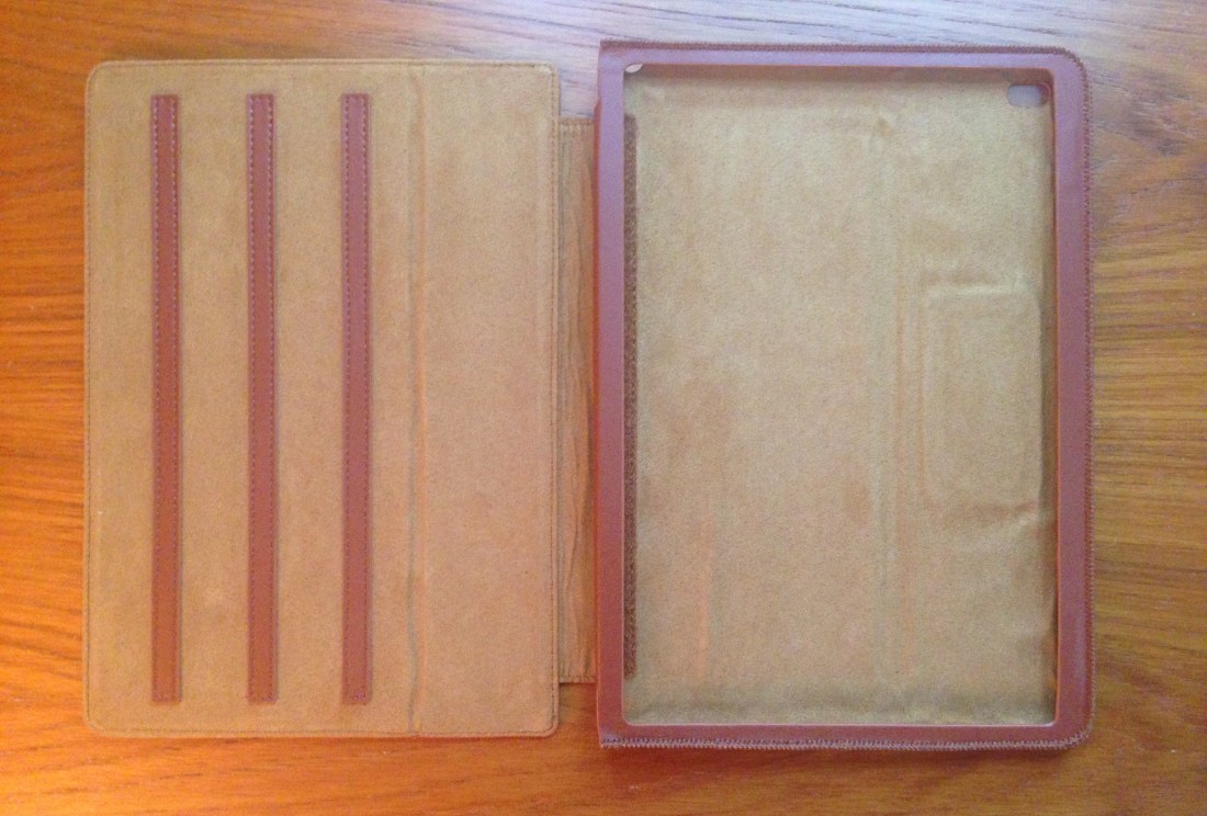
Where to Get It


2_Open and Empty


You can learn more about the KAVAJ case at their Website here. And it’s available on Amazon here.


KAVAJ provided me the case for the review, without expectation as to my review’s content.

Review of WaterField’s Spike Wallet

I’m increasingly finding myself drawn to the high-quality goods of manufacturers in New York (here and here) and San Francisco.

WaterField Designs is based in SF. They make an excellent keyboard slip case, which I covered here. For the last few weeks I’ve been carrying around their super-slim and stylish Spike Wallet.

It looks like this:


Spike Wallet by Pen


The best thing about it is its size–it’s small! It’s about the size of an iPhone 5, so it actually fits really comfortably into a front pocket, right next to a phone. Actual dimensions: 4.3″ x 3″.

This can’t be your hold-everything wallet, of course. I’ve been able to easily fit into it: two debit cards, some cash, an insurance card, and my driver’s license. This is what I need most days. However, the kids’ insurance cards or any gift cards I have still have to go in another, larger wallet. (Or just in my satchel somewhere.)

Getting things in an out was a bit tough at first, but the full-grain leather continues to soften with use. Here’s what it looks like filled:


Spike Wallet Filled


The closure mechanism is minimalist and slides right into place, easily and snugly. It’s perfectly executed.


Spike Wallet Open Empty


There’s only a little bit of branding, and it’s on the back. I probably would have preferred something more subtle, like on the inside flap of the wallet, for example.


Spike Wallet Back


The leather feels great in the hands, the stitching is secure, and the size is right for daily use. This piece of gear has been truly enjoyable to use.

WaterField makes a lot of other great-looking gear, which you can learn more about here. Find the Spike Wallet here. Retailing at $25, it comes in “Wallet”/large size (which I’ve featured here) as well as “Business Card”/small size.


Thanks very much to WaterField for the product review sample, given to me for purposes of review, but with no expectations or influence on the review’s content.