Fountain Pen Review: Kaweco STUDENT Fountain Pen Vintage Blue (Extra Fine)

Ah, Kaweco: The German writing implement company is almost a century older than I am, yet I just learned of them this last year. Now in addition to my review of their SKETCH UP pencil, I bring you a review of the Kaweco STUDENT Fountain Pen. The color of the pen is Vintage Blue; the nib is Extra Fine.


The STUDENT Fountain Pen’s Construction


The STUDENT Fountain Pen feels just about perfect in the hand–ballpoint pen writers will find it to be of suitable length. It’s sturdy but not heavy.

And it looks great:


Cap On


Here it is with the cap off:


Cap Off


It can fit just fine into a pants pocket, though you may not want it bumping up against your keys. (I prefer a case for my fountain pens.) You will notice in the image above that there is a built-in clip. The vintage blue color and silver clip make it look really good in a front shirt pocket–and it will stay there, too.


Writing with the Pen


Kaweco STUDENT Pen


I’m still new to the world of fountain pens, but I do know that even flow in fountain pens is not a given. With the STUDENT pen it’s all smooth sailing. This particular pen ships with royal blue ink, which looks fantastic. It’s easy–even for fountain pen neophytes–to buy and pop in ink cartridge refills.

As to using this pen posted or unposted (i.e., with the cap on or off), I suspect the intention is to use it however you prefer. The downside to keeping the cap off, of course, is that you might lose it! With the STUDENT fountain pen, long periods of writing might call for keeping it unposted, so as to slightly reduce its weight.

Finally, I passed the pen over to a fellow fountain pen user for this thoughts:

Nice, even ink flow. The pen is amply sized. I have medium to large hands and found that when the cap was posted the feel was hefty but comfortable and well-weighted. A smaller hand could use the pen unposted. I liked the rich blue of the barrel. Not gaudy, but also not muted.


EF Nib with Cap


You can check out Kaweco’s STUDENT fountain pen line here. (This pen is Item #10000781, and came with a nice tin gift box.) And if you are so inclined you can order the STUDENT pen via JetPens or Most Wanted Pens.


Many thanks to the fine folks at Kaweco for the pen for review! Check them out here.

Bill Mallonee’s Lands & Peoples: Review and Ruminations

Bill Mallonee is a man of many albums–some 80 by the last count.

His 2015 album Lands & Peoples begins with a folksy steel-string guitar and upright bass, lifted up to the stratosphere by ambient loops in the background.

Then, before you know it, it’s all about that bass and Mr. Mallonee’s tried and true vocals:

Somewhere between a border town and outside Santa Fe
Where the moonlight casts her heavy sigh and sent me on my way
You learn to trust the compass stars woven in her hair
And you learn to read the poetry hanging in the thin air

This has to be autobiographical. How else could a songwriter produce so many meaningful lyrics, album after album after album? He finds them “hanging in the thin air”–the secret revealed.

Why, then, is Mr. Mallonee still “a drifter”? The music industry embraced him at one time, especially through the commercial success he experienced with Vigilantes of Love. (Yes, I even remember hearing them on the radio!) Mr. Mallonee, however, still has friends in earthy places:

Should you become a drifter, the Good Earth is your friend
And you learn to read her language till the bitter end

His vulnerability on the first song is what his listeners have come to expect and love about his music:

There was a Rosary on the rearview; this time it went unsaid
But, if Love gets the last word, maybe, I’ll be “ok.”

After the opening confessional, Lands & Peoples moves into the grooving “Hide Me in the Darkness,” a song where the upbeat tempo and its closing lines are a mismatch:

Just look on the bright side…just tend to your homestead
Just look on the dark side…plow’s broke and the horses are dead

But this is Bill Mallonee, gosh darnit, so the juxtaposition is surely intentional. It does not go unnoticed by the careful listener.

I think my favorite track on the album is “Steering Wheel is a Prayer Wheel,” which calls to mind everything I loved about Winnowing, his previous full-length album. And have I mentioned how much I like the drumming on this album, at its best on this fourth track? Who does it, you ask? You guessed it–Mr. Mallonee himself, the same one who sings/prays:

There’s only so much you can freight on your heart’s shaky scaffold
And the steering wheel is a prayer wheel on the open road

Mallonee-Lands and PeoplesOne of Mr. Mallonee’s enduring gifts is being able to turn on a dime from a heart-wrenching tune like “String of Days” to the gratitude-laced “Sangre de Christos.” The former is an addict’s lament, bemoaning the “losing streaks” that go “on for miles.” But he follows it with a prayer of appreciation uttered “under the blue skies.”

For Mr. Mallonee, it seems, life is all of one piece–ups and downs, joys and sorrows, laments and thanksgivings. All of it is as “poetry hanging in the thin air,” and he continues to pull it out, jot it down, and sing it like he means it–because he does. I love that about him.

I found myself having a hard time hanging in there with the second half of the album, but even so, there are more gems:

There’s a story that I’m writing
Would you help me hold the pen?
On every page you will shine just like a star
And if that deck is stacked?
We’ll just laugh and leave the table
And leave the dealer all alone there in the dark

And then “Hope the Kids Make it Out” came on, the second to last track. Ah, those interlocking guitars! The pulsing bass, the perfectly toned drums… the rock and roll. That’s one of my favorite Bill Mallonee songs in the last decade.

I still have a preference for Winnowing, perhaps in part because I randomly stumbled on it late one Friday night, not having kept abreast of Mr. Mallonee’s catalogue for some time. I stayed up and listened to the whole thing all the way through, a moment of being-ministered-to that I needed then. So perhaps it’s unfair to compare this newer full-length to that work of genius, but so it goes.

One way or the other, Lands & Peoples is pretty easily a top 10 Bill Mallonee record, through and through. (About how many artists can you say their album is one of their best 10… and it be a compliment?) That he covers so much territory–drums, vocals, guitars, bass, etc.–makes it all the richer a listen, musically and lyrically.

You can learn more about the album, read the lyrics, and listen and download here.


My sincerest thanks to the musical powers that be, who gave me the album to download for review, but with no expectation as to the content of my write-up.

New Story of God Bible Commentary Volumes: Genesis and Romans

SGBC GenesisScot McKnight set the bar high with his Sermon on the Mount volume in The Story of God Bible Commentary series.

Now there are two more volumes: Genesis, by Tremper Longman III, and Romans, by Michael F. Bird.

As Tremper Longman III describes in the video below, The Story of God Bible Commentary has three primary focuses:

  1. Listening to the Story
  2. Interpreting the Story
  3. Living the Story


You can read my review of McKnight’s Sermon on the Mount volume here. Also published so far have been Lynn H. Cohick’s Philippians and John Byron’s 1 and 2 Thessalonians. You can find the series landing page here.

Feb. 8: Happy International Septuagint Day!

International Septuagint Day


Today, February 8, is International Septuagint Day. Happy LXX Day! So read yerself some Septuagint today, in Greek or English.

A few more links to explore:

App Review: Day One (Day One 2 Coming Soon)

Day One is easily the best app for keeping a journal or life log–if you’re going to do it in a 1s and 0s environment, rather than on paper.

In this post I briefly review Day One. I’ll leave for another time the question of whether journaling by hand or by phone/tablet/computer is preferable. Okay, actually… I’ll answer that now: better to do it by hand, because… reasons. But Day One has photo capability, so it has served as a nice digital repository for me to chronicle my kids’ growing up, without having to post it on Facebook, etc.

Day One offers sync via iCloud, Dropbox, or their own sync service, so you can keep everything together on iPhone, iPad, and Mac.

I really like the layout, which allows you (much like in this blog, for example), to combine headings, text, and photos. Check out this sample entry on Day One for Mac:


Mac Sample Entry

You can even add an entry right from the menu bar, so that you can write down that brilliant insight before you forget it.


Mac Menu Bar Option


Your entries could be text, a (single) photo with text, location-based entries (that also pull in the weather automatically), meeting notes, day debriefs, etc. Each entry is automatically time-stamped. The possibilities are pretty robust, and folks use Day One in lots of different ways. The tags feature especially enables this, as you could use the built-in tagging system to sort by “journal,” “family,” “song lyrics,” “insights,” “questions,” and more.

My first question is–to the extent I use Day One as a sort of photo-journal (especially of the family), will having my info in a proprietary format some day cause issues? That’s always a possibility with software (score one for physical journals and photo albums), but Day One allows for PDF export, so you don’t really have to worry here.


Mac PDF Export


You can also set a reminder so that Day One reminds you each day to write:


Mac Reminders


It looks and works really well on iPhone and iPad too.


iPad Menu Landscape 2


If you want to try the app and really put it to use, Shawn Blanc has written a pretty thorough ebook: Day One in Depth.

You can find Day One for iOS here; the OS X app is here.

Also… if you want to wait a few days… Day One 2 releases this Thursday. I haven’t used the new app, but beta users seem to love it. You can check out what’s new in the FAQs here.


Thanks to the makers of Day One for the review copy of the app on Mac, given to me for this review but with no expectation as to its content.

Book Notice: Ruth (Zondervan Exegetical Commentary on the OT)

Ruth ZECOT


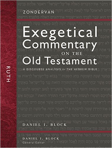
Just a short post today to alert you to a new commentary on the book of Ruth: Daniel I. Block’s volume in the Zondervan Exegetical Commentary on the Old Testament. Ruth is just the third published volume in the series, formerly called Hearing the Message of Scripture. Block is the General Editor of the series.

I reviewed Block’s Obadiah here. And Kevin J. Youngblood’s Jonah volume is probably the best commentary I’ve worked through on Jonah. (And there is no shortage of Jonah commentaries!)

You can learn more about the Ruth volume here. I’ll write about it again in due course.

Pencil Review: Kaweco SKETCH UP Classic Chrome

More than half my writing by hand these days happens with an implement from Kaweco in Germany. They are brand new to me, but Kaweco has been making writing instruments since 1883.

I’m especially eager to share my impressions of their outstanding LILIPUT fountain pen, but I’m saving that post for later. Here I briefly assess their SKETCH UP pencil.


The Pencil’s Construction


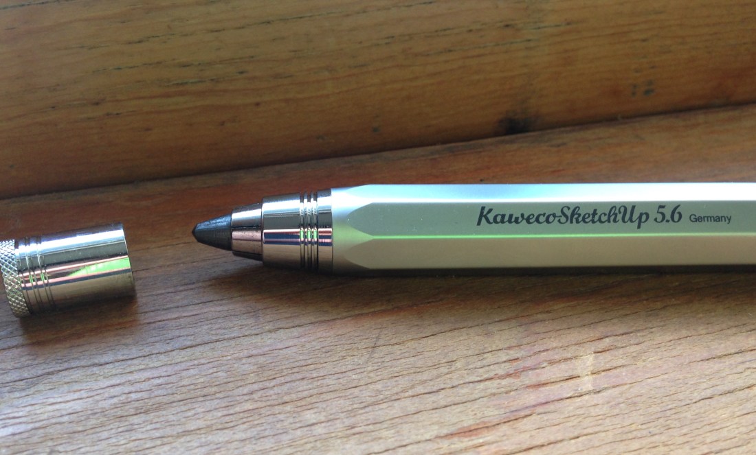
The SKETCH UP is a heavy beast. You will feel manly or womanly every time you pick it up to sketch. Its octagonal barrel somehow adds to its impressiveness. You simply cannot ignore its heft.


2_Side View


Having used pretty much only No. 2 pencils my whole life–with mechanical pencils constituting my sole upgrade–the 5.6 mm lead felt mammoth, yet also softer and smoother than any other pencil I’ve used.

The SKETCH UP is not as long as your run-of-the-mill pencil, so it will fit into any pocket.

I am only slightly embarrassed to admit it took me a few tries to figure out the mechanism that feeds the lead through.


3_Pencil Point


You have to push the button at the top of the barrel with one hand (to release the lead) and use another hand to adjust the lead to the desired length, before releasing the push button again. Then you’re all set to draw.


Writing with the SKETCH UP


4_Kaweco SKETCH UP


Writing and sketching with the SKETCH UP feels great. Shading is easy and smooth. It’s maybe heavy for writing a lot of words, but even for taking notes, it would do well. Sketching, however, is its primary intended purpose, and for that it is a workhorse.

And, get this: it’s got a built in point sharpener. The push button uncaps to sharpen your point.


1_SketchUp with Sharpener


You can check out Kaweco’s SKETCH UP line here. (This pencil is Item #10000946, and came with a nice tin gift box.) And if you are so inclined you can order the SKETCH UP via JetPens or Most Wanted Pens.


Many thanks to the fine folks at Kaweco for the pencil for review! Check them out here.

Children’s Book Recommendation: Big Bot, Small Bot

Front cover


Marc Rosenthal’s Big Bot, Small Bot: A Book of Robot Opposites is short and simple, but wonderfully executed.

The book is just what it says: through colorful images and some imaginative flap-lifting, kids and parents follow some “retro-futuristic robots” through opposites like wet/dry, full/empty, and so on.

When you lift the flap, the opposite is revealed. So you start with this:


Quiet


And end up with this!


LOUD


I really wanted to just take a picture of every opposite and show it to you, but I will simply recommend the book, instead. The target ages are 2 to 5, which seems spot on to me. (You can see more images here, if you like.)

The book is funny, clever, and engaging. My 3-year-old was a fan from the first time she read it. The paper is nice and thick, too. That means it will give up a pretty good fight when your toddler decides–in a fit of unexplained and inexplicable rage–to rip all their books. (I’ve heard some kids do this.)

It makes for some excellent parent-child reading and interaction.

Find the book at POW! Kids here, or at Amazon here.


Thanks to the good folks at POW! Kids Books for sending the book for review, though that did not influence my opinions.

Notebook Review: Hard Bound Cloth A5 (Orange!) by Sweden’s Whitelines

In college, when I was a prolific journaler, I filled up two or three wonderful lay-flat books with all sorts of feelings and existential insights/ramblings. My journal of choice featured semi-invisible lines, which were a guide to keep me writing straight, but subtle enough that I didn’t really notice once I looked at a filled-up page.

I noticed this fall that a Swedish company makes such a subtly-ruled notebook: Whitelines.

First, let me show you the outside of the orange A5 Hard Bound Cloth notebook:


Front


The linen cloth gives the hardcover notebook an organic feel. The orange ribbon marker looks good, too. This is definitely a classy notebook.

What sets Whitelines apart from other notebooks is the… well… white lines it uses. Here’s what a page looks like:


Full Page of Writing


The white lines look great on the colored 80g paper. You can tell from the page above that there’s a little bleed-through, though. This was using a Pilot G2 07 gel pen. An extra fine fountain pen fares better.

The branding is minimal, but I can’t think of another notebook I’ve used that had the company name on every page:


Whitelines Logo on Page


I have gotten used to this in time and don’t really notice it anymore.

Apart from the really nice experience of writing on white lines, this notebook lays flat really well, even when you’re writing on the first few pages on the left-hand side. Kudos to the makers for getting that right! The sewn binding is welcome, too. This means the notebook will last a long time.

I use the Whitelines notebook as my primary journal, since it has a classic look and feel. And because this particular book is orange, I will (probably) never lose it.

Want to give it a go? Whitelines has a variety of .pdf samples of their pages here, so you can print them out and try it.

You can see more Whitelines products here. The Hard Bound Cloth A5–available in both orange and grey–can be found here.


Many thanks to the fine folks at Whitelines for the notebook for review!

Not to Shill, But… (Last Day of Logos Bible Software Discount)

Logos 6 Gold


I have mixed feelings about Logos marketing–some criticisms expressed here–but I still do, at least for now, participate in an affiliate program of theirs. This helps, among other things, to pay for some of this blog’s minimal expenses and has even in the past funded seminary coursework.

I have no intention to shill, but I do want to share for interested readers that the rate of 15% off any base package in Logos is changing as of tomorrow (12:00 a.m. PST) to 10% off. So if you’re thinking of upgrading, you can do it for cheaper today than tomorrow. If you don’t have money to do it, don’t sweat, pour yourself a cup of tea, and read this post instead. If you do purchase, Logos feeds a percentage of the purchase back to me. If you’re interested, you just order a base package (new or upgrade) through this Logos landing page.

Or use the promo code ABRAMKJ6 when you check out with a base package in your Logos cart. My review of Logos 6 is here.