My inordinately strong appreciation of Bible software started with BibleWorks 7. BibleWorks 10 was just released, and it came yesterday to my mailbox on a thumb drive.
Go to www.bibleworks.com to see what’s new. After I’ve had a chance to install and use it, I’ll write a review here.
I enjoy my writing medium more than ever before, now that I’m writing daily in Ulysses.
I started to review the app here; now I conclude my review of Ulysses for Mac.
3. Getting Text Out of Ulysses
You need to know a little bit about Markdown to fully utilize Ulysses. This is from their help manual, which takes the form of a series of interactive Sheets in the app:
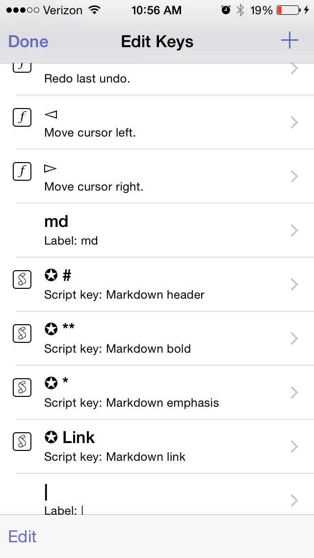
“Ulysses uses so-called minimal markup to define, not format or style, text passages. The full list of available definitions is accessible via ⌘9, and it should have you covered left to right. From headlines to lists, to images and footnotes, you simply assign meaning to text passages by entering some easy to remember shortcuts.”
(P.S. I just used that keyboard shortcut and drop-down menu to make the above a block quote… or I could have just typed in “>” before the quotation.)
It’s taken me a little time to learn Markdown (though there’s really not that much to it), but once you have, you can take advantage of Ulysses’s export options.
Again, from the help files:
“Now for the fun part: Ulysses can output your writing to a host of standard formats, such as Plain Text, RTF, HTML, ePub and even PDF. It does so by translating your plain text input based on the definition of the minimal markup. If your brain starts to hurt, here’s a simple example…”
Markup in Ulysses
Here’s why I could write this two-part blog post series in Ulysses (using Markdown), export it to html in WordPress, and then have you read it now as if nothing ever happened: Ulysses “will translate the emphasized passage to semantically correct <em>, and the headline will be tagged with <h2>.”
The idea here is that once you know and use Markdown, you don’t really have to do much by way of thinking about formatting.
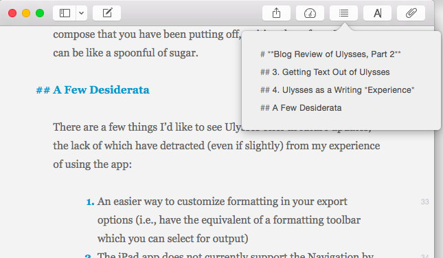
When you’re ready to export, you can click to bring up the window at right (or type the shortcut ⌘6):
From here you can preview, copy your text to clipboard, save it to a file, or open it with various apps. (I use Nisus Writer Pro to open my Ulysses sheet as a text file.) You can see your text as RTF, PDF, HTML, plain text, or even a nicely formatted ePub so you can publish your own ebook. Ulysses automatically converts your markup to its proper formatting in the finished product.
The Quick Export function is varied and rich enough, but it takes some fussing to get your text to look how you want it. (This fussing starts to defeat the purpose, in my opinion, of the supposed simplicity of using Markdown.) You can go to Preferences and add your own Styles, so can customize how your text exports, if you need more than just the default Styles Ulysses gives you.
Styles in Ulysses
But this is more effort than unaccustomed writers may appreciate having to make.
There is a Style Exchange where users post their own formatted style sheets, which you can download to your own Ulysses.
And if you do decide to go all in with Ulysses (I’m there), there is a reference guide you can work through to figure out how to make your own Styles to export just how you want.
(See also here for a succinct overview on Ulysses’s blog about exporting.)
4. Ulysses as a Writing Experience
I love writing in Ulysses. Required export efforts and occasional iCloud syncing frustrations notwithstanding, it is a beautiful app in which to put down and rearrange words. It’s smooth and visually appealing. And Ulysses really does accomplish the dual goal of the developers to be (a) distraction-free in its layout yet (b) still give you easy access to any feature a writer would need.
You can keep notes and goals aligned to a given Sheet (i.e., document), and view them from the Attachments pane, or detach them and see them as their own free-floating windows. This really enhances the experience of writing in Ulysses. You can also bookmark paragraphs and favorite Sheets, so navigating through stacks of writing is easier than you’d expect.
I’ve used Ulysses to help inspire me to finish a couple of mid-sized pieces of writing recently—pieces that I was interested in but lacking some motivation for at the time of having to produce them. I told myself I could use Ulysses to write, and the prospect of using that environment made a big difference!
I know this may be silly, but if you have some emails you need to compose that you have been putting off, writing them from Ulysses can be like a spoonful of sugar.
A Few Desiderata
There are a few things I’d like to see Ulysses offer in future updates, the lack of which have detracted (even if slightly) from my experience of using the app:
I would love there to be an easier way to adjust formatting in the Quick Export options (i.e., having something like the equivalent of a formatting toolbar which you can select for output, rather than having to do it through Styles). Also, I haven’t found a way to easily adjust image sizing (from Ulysses) when exporting a Sheet to a blog post–a process itself which could stand to be more fully automated.
The iPad app does not currently support the Navigation by headings feature I so appreciate in Mac. In fact, the same icon/button is present in iPad, but does something totally different.
Navigating by Headings
I do hasten to add, however, that the Ulysses for iPad app is stellar, easily one of the best apps in the App Store and my current favorite app for iPad.
It would be lovely if there were a way to include the word count as part of the Editor screen. It’s easy enough to find it in the Statistics or Goals portion of the Attachment pane (and both of these pop-ups can be torn off and left free-floating), but a simple word count bar at the top or bottom of the Editor would be nice. The iPad app does offer something along these lines.
I believe this is mostly the fault of the iPad’s lack of support for .rtf, but getting writing from Ulysses on iPad into a format that is .rtf-ready (not to mention .rtf itself) is just about impossible. If you can hop over to Ulysses on a computer, it’s doable, but iPad alone won’t really work for moving your content to rich text.
By the way, my love for Scrivener has not changed, and it’s still a fuller-featured environment for getting lots of research and snippets organized—and has its own really nice distraction-free writing mode.
But Ulysses is on iPad now, too (Scrivener: not yet, but close-ish), and it’s beautiful on the Mac, so when I’m doing long periods of writing, I primarily use Ulysses at as many points along the way as I can.
You can download a free demo trial of Ulysses for Mac here. More about the iPad app is here. Check it out, and play around with it for a bit. It’s helped me really rediscover my love of writing.
Thanks to The Soulmen Gbr, developers of Ulysses, for giving me a download for the review. See my other AppTastic Tuesday reviews (yes, this one is a few days early) here.
Looking for a good scientific calculator that your kids (or roommate) won’t make off with, because it’s downloaded as an app to your iOS device? (Which your kids or roommate might also abscond with, but still….)
PCalc is a beautifully-designed, dynamic calculator for iPhone and iPad, available in the App Store. Below I review the definitely-worth-its-$9.99 app. There is a free, “lite” version available here.
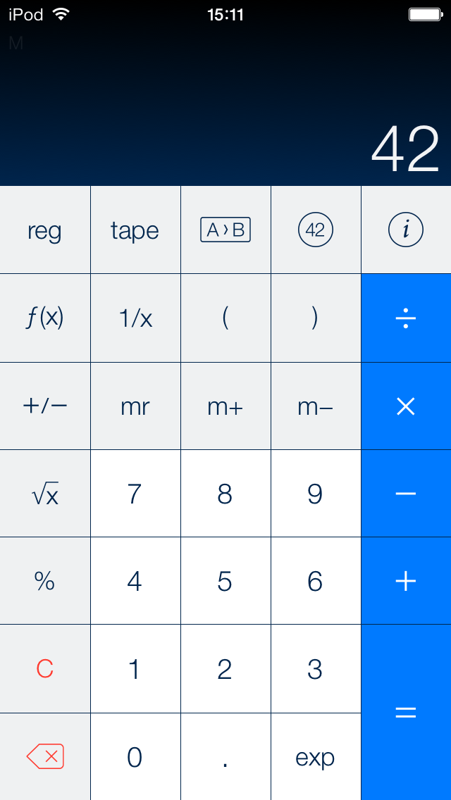
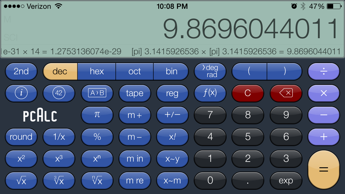
PCalc functions with zero lag, and has a really nice layout, which you can change to suit your preferences:
This image via TLA Systems Ltd.
I liked that view so much I didn’t even think to look for different display options till weeks later. But then I found this:
PCalc is ideal for scientists, engineers, students, programmers, or indeed anybody looking for a feature-rich calculator for the iPad, iPhone, or iPod touch.
It includes an extensive set of unit conversions, a paper tape, an optional RPN mode, engineering and scientific notation, as well as support for hexadecimal, octal and binary calculations.
My favorite feature–that I’ve not seen in any of the other five or six calculator apps I had downloaded and promptly deleted from my phone–is that PCalc can run conversions for you: currency, in the kitchen (good for those of us who still can’t go fluid ounces to cups, which is ALL of us), energy units and more.
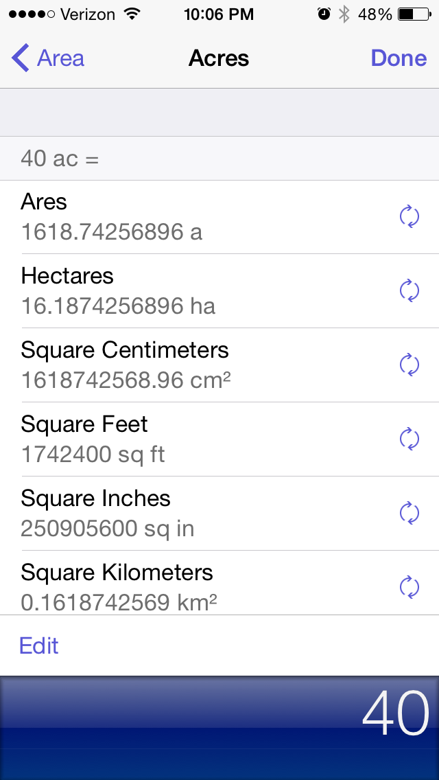
Listening to the new Kendrick Lamar, I might want to know how many square miles 40 acres is. With PCalc, I have my answer within a few taps:
It has a bunch of Constants stored, to which you can add your own:
There are also a ton of functions this app can perform that I probably would have loved in my high school Calculus class, but would have trouble with now. You can do more when you rotate to landscape mode:
Note the Ticker Tape underneath the number up top… that’s your computation history! You can even swipe back from the results screen to have PCalc re-perform your last operations.
This is a highly advanced calculator. I can’t say whether science and math students can put away their TI-80-whatevers, but they should at least download PCalc first.
Need to quickly figure a tip, or something else? Without even unlocking your device, swipe down to the Today view and find the best-looking, most functional widget you’ll probably see on iOS 8:
Even Apple’s own Calculator app does not have access from the swipe-down Today view.
PCalc is a fantastic app, and the last non-graphing, scientific calculator app you’ll ever put on your phone. See the full feature list here, and look at many more screenshots here.
Thanks to TLA Systems, the makers of PCalc for iOS, for giving me a download of the app for this review. See my other AppTastic Tuesday reviews here.
I can hardly believe the technology on a little iPhone exists to do this, but this is now how I am going to take and process meeting notes from here on out.
This means I simply open the Drafts app (which is quite aesthetically pleasing, and fast, too) and take meeting notes there…including marking action steps with the checkbox keyboard shortcut key (!).
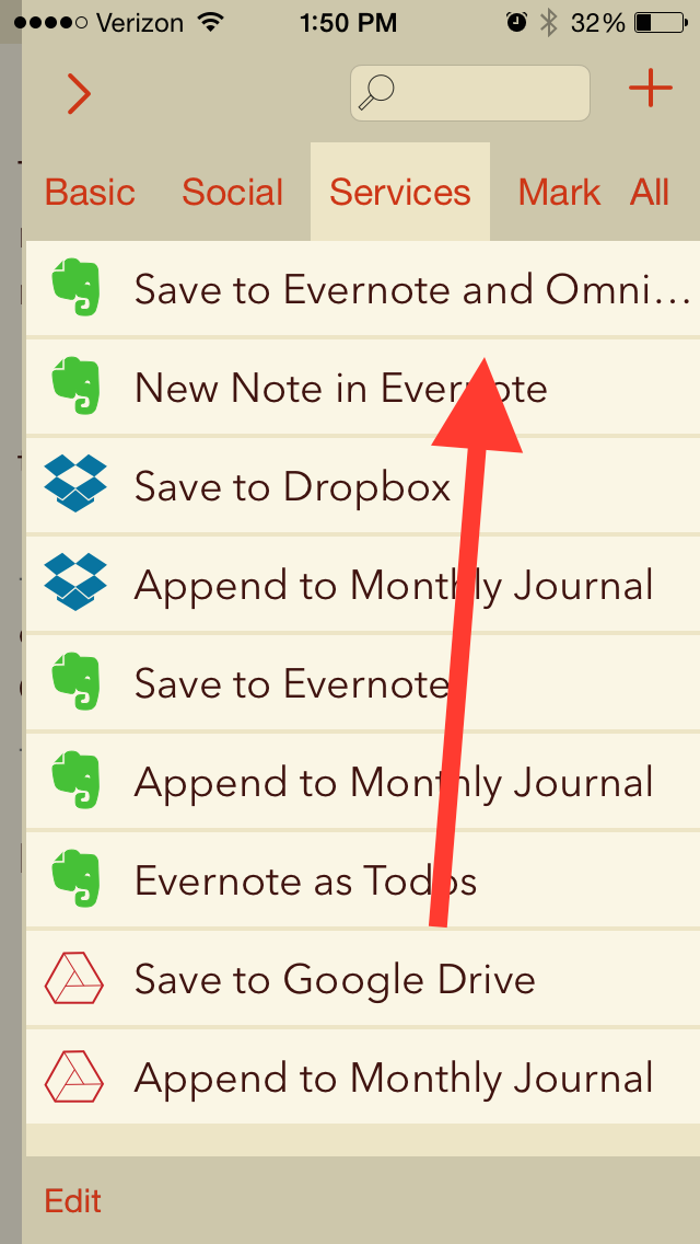
Then I tap the action above, and all my meeting notes are saved as an Evernote note, with all the checkboxes I made automatically converting to OmniFocus tasks.
Many, many thanks to Agile Tortoise for the awesome app and to @rosscatrow for the action above to install into Drafts 4. A good step forward in my ongoing quest to stay organized.
Provide the easiest and quickest way to get to a blank text entry screen on iPhone and iPad.
Allow you then to send or export that text to as many other apps as possible.
This may sound like one of those apps that developers made just because they could, but I’ve been surprised to find myself increasingly reliant on Drafts 4.
Just the last two days I used it to (a) jot down some stand-up meeting notes (which I then exported to an OmniFocus task) and (b) send an email to someone when I didn’t want to have to be distracted by unread emails in my inbox.
Open the app, and you get a blank screen, into which you can quickly type (or dictate, via Siri) text. I recently was fortunate enough to have inspiration for a sermon outline strike me when I was doing some chores around the house. Not sure what to do with this newly found locus for creativity, I quickly reached for Drafts and jotted my thoughts down:
From here I could access a wealth of sharing options:
This particular draft went into Evernote, where I could easily get it later. I could have exported it some other ways:
Also amazingly cool is that when I exported it to Reminders, Drafts made each separate line into its own task:
This is sweet enough–an app that lets you quickly jot down text and export/share to just about anywhere. But Drafts is built with an eye to detail. You can make your text look nice, too:
Note the option to have a night mode. And all those fonts!
You can even re-arrange your text from within Drafts, just by virtue of having started a new line when you were entering text:
You can edit the keyboard keys that are available to you:
Note, too, the Markdown capabilities
There are quite a few settings you can adjust:
And Drafts can keep everything you enter, regardless of whether you’ve shared or exported it. (Drafts also keeps a record of where you’ve shared/exported your draft.)
Yes, you guessed it, there’s a Today widget, too:
Drafts 4 is just as awesome on iPad (not pictured here) as it is on iPhone. The only possible downside to this app is that $9.99 is more than most iOS users are used to paying for an app. But it’s easily one of the most carefully developed and detailed apps I’ve used, and robust in its features and capabilities.
It’s well worth checking out, and has found a home in my daily workflow.
Thanks to the fine folks at Agile Tortoise, the makers of Drafts 4, for giving me a download of the app for this review. See my other AppTastic Tuesday reviews here.
There are two things that seem to be all the rage in the world of writing and software: (1) Markdown and (2) “distraction-free” writing environments.
I’m more interested in the latter than in the former—I’m actively trying to root out distractions wherever they may be found. But Markdown is easy, everywhere, and seems a good way to explore learning other, more complex coding languages.
Ulysses offers both, and then some, with the goal of eliminating anything that takes the writer away from her or his craft of constructing words, sentences, and stories.
In fact, I’ve written and edited this post in Ulysses, then exported it as html into my WordPress blog.
In this review post and a second follow-up entry soon to follow, I write about:
Getting Text Into Ulysses
Ulysses as a Writing Environment
Getting Text Out of Ulysses
Ulysses as a Writing Experience
1. Getting Text Into Ulysses
Good writers need good tools, so a serious scribe will take time to track down a trustworthy tool, but one does want to be able to just open whatever program and start writing.
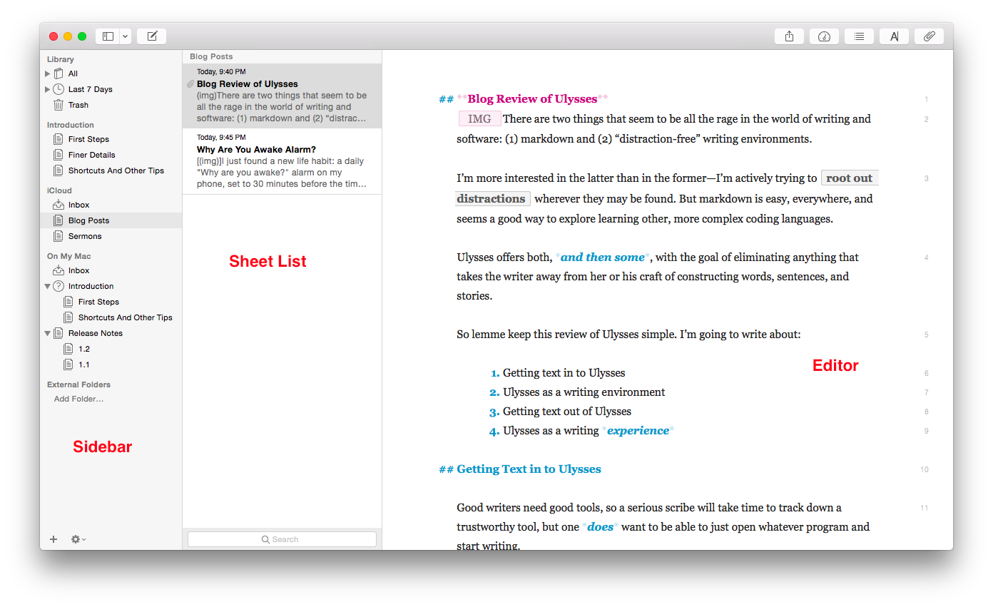
Getting to a new Sheet (Ulysses’s more-or-less equivalent of a document) is easy, even with no experience of the app, so one can just start writing in the default three-pane workspace:
The Editor is where the magic happens (i.e., you write the stuff). Using keyboard shortcuts or the menu bar, you can have one, two, or three panes visible. If you’re really hunkering down, you might not need to see your Sheet List, so can go to the Editor Only view.
However many panes you want to see at once (and Ulysses also allows multiple Windows open at once), starting to write in Ulysses is easy.
But what about importing text you’ve already got somewhere else?
Easy (mostly). You can copy-paste, even preserving formatting, or you can import a file wholesale by dragging it from a Finder window into the Ulysses sidebar, if it’s of the kind Ulysses will recognize. (My .zrtf Nisus Writer Pro tests did not work, but Ulysses did accept a sample .rtf file and even a Microsoft Word .docx file.)
2. Ulysses as a Writing Environment
So you can get writing right away in Ulysses, either from scratch or from pre-existing projects in (some) other formats. That’s a plus.
Writing in Ulysses itself has been a very positive—even a focusing and relaxing—experience. More on that in the next post. Ulysses as a writing environment requires some effort to learn.
For example, there’s the terminology (Sheets, Groups, Filters), though that’s pretty easy to pick up right away. And there’s the three-pane layout—though Mac Mail and other apps have prepped users for that. There’s also the lack of tie-in to the Mac Finder and files with file names.
That has taken some getting used to, but it’s not cumbersome by any means. In fact, Ulysses’s powerful search option (⌘-O) has meant I can always find anything I am looking for—quickly.
One nice touch in the app is that there are three Groups full of explanatory Sheets that tell you just about all you need to get started:
First Steps
Finer Details
Shortcuts And Other Tips
Here’s what they look like (in the easy-on-the-eyes Dark Mode with Dark Theme):
They’re like help files, only more fun and experiential.
Note also the fourth pane at far right, where I have added some Keywords (“I read this”—I have used that as a label to track my progress through the help Sheets) as well as a Note. Via this Attachments Bar you can also add an image or set a word count writing goal for yourself.
And the app can do some pretty sweet stuff. Here’s a sampling:
You can select a couple of Sheets and “glue them together” using ⌘J, which is good for putting chapters or sections together
You can split a Sheet into two Sheets, which is what I’ve done with this blog post that started as one and now will be in two parts
From the Editor (the pane where you do the writing) you can go up and down your various Sheets using the ⌥⌘↓/↑ keyboard shortcuts
The Show Markup option (keyboard shortcut= ⌘-9) is really helpful, especially to folks like me who are new to Markup
Did I mention how easy on the eyes the Dark Theme/Dark Mode option is for nighttime writing?
You can make comments to yourself using Markup that will show in the Editor pane but won’t export when you’re ready to publish
The few things that at first seemed like limitations in Ulysses were, in fact, easy to pull off by selecting the right menu item.
I haven’t been able to find anything like navigation arrows in the toolbar—having these readily visible would easily allow one to move between Sheets and search results without having to have two app windows open at once, but there may be a solution I just haven’t found yet.
So far, though Ulysses has required some adjustment to my workflow, I’ve really been enjoying writing in it.
My Ulysses Statistics are telling me this post has exceeded 900 words, so I’ll write more next time about (3) Getting Text Out of Ulysses (i.e., export functions) and (4) Ulysses as a Writing Experience.
Thanks to The Soulmen Gbr, developers of Ulysses, for giving me a download for the review. See my other AppTastic Tuesday reviews here.
Back in the days before Facebook and iPhones, I walked around my college campus with a mini-cassette recorder to capture my freshman year pontificating about all aspects of life. It’s amazing how lengthy and involved some of those reflections were.
After a while I started holding forth verbally less and rocking out musically more, using the recorder to get all my songwriting ideas down right away.
For as advanced as the iPhone is–and it includes a built-in voice memo recording app–it wasn’t until I started using the app Say & Go that I started treating the phone as a suitable replacement for that Sony tiny tape recorder.
First, let me show you how I use the app, then I’ll show you a few of the under-the-hood settings you can tweak.
A brilliant idea comes my way, I grab my phone, and launch Say & Go:
Because of how I have the app configured, the second I tap the app icon, it starts recording:
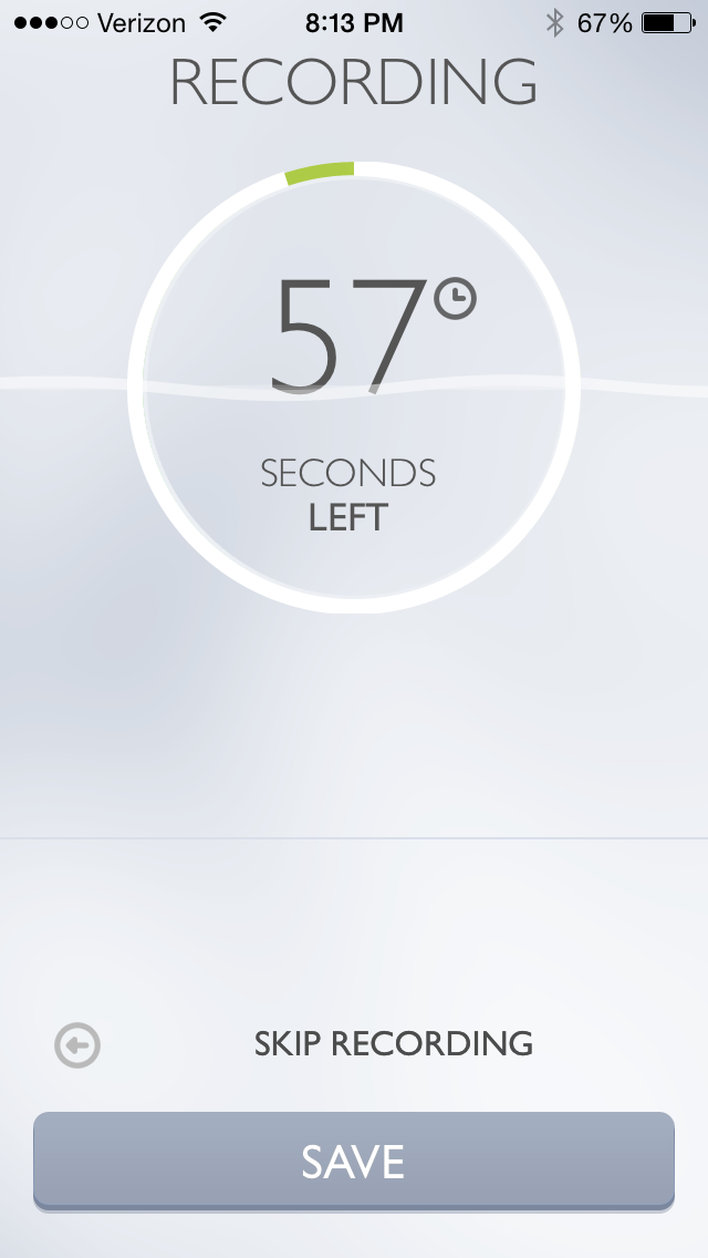
The app intentionally limits recording length to anywhere between 4 and 15 seconds. I find 9 seconds is a good amount of time to get most ideas down. But what if I want to record a song snippet?
I can simply swipe right or tap on “Longer Recording” in the image above to get a minute-long option:
As if this isn’t sleek enough (and what a sweet, elegant layout this app has), the best part of the app is what’s next: I can now send my recording to an email address of my choosing, or set the app to save the recording to my Dropbox or… wait for it… to Evernote.
All I had to do was enter my Evernote email-to address in the “Default E-mail Recipient” line above. Now, after a single tap on the icon on my home screen, all my recordings go straight into Evernote as soon as the recording time runs out. Impressive.
There are a few other customizable settings. In the short workflow described above, I have “Autostart” enabled, but you don’t have to:
And here are some of the other settings you can adjust:
It’s a brilliantly designed and useful app. Read more about it here.
Thanks to Dawid Pietrala, the developer of Say & Go, for giving me a download for the review. Check out the app’s iOS page here. See my other AppTastic Tuesday reviews here.
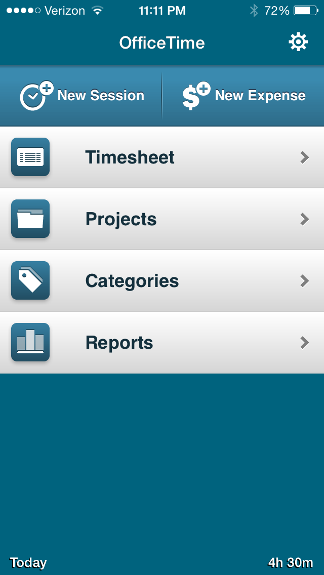
The best iPhone time tracker I’ve seen is OfficeTime. It is simple, fast, effective, and easy to get in and out of quickly to start tracking time and get right back to work.
You can set up your Projects and Categories (I use these as two levels of task grouping), and tap on each to see how much time you’ve spent in a certain part of your work. I don’t use the Expenses feature of the app, but if you were a sub-contracting consultant keeping track of work for multiple clients, OfficeTime would be immensely helpful in tracking billing.
Pulling up a new time/task entry is easy:
“Notes” allows you to write more details about what task you’re working on.
Not only can you look at all your time entries in a week by Project and Category, but you can see (as below) a virtual Timesheet of your week.
The iPhone app can sync automatically to the desktop version of OfficeTime, though you have to actually be on the same wireless network to do it. Similarly, the iPad app can sync to a computer (and vice versa), but the data cannot sync automatically between iPad and iPhone apps. That is one of the few drawbacks I’ve found in OfficeTime.
I’ll post more in a future review about the desktop app, and also report back on exporting features.
The lack of a full-bodied sync option hasn’t really stopped me, though, since I can keep all the data on my phone and then sync with my work computer when I’m in the office.
OfficeTime has a free Mac trial version, and a free iOS version to try here. The paid iOS version is $7.99 and works on both iPhone and iPad.
If you are the time tracking sort, and want a full-bodied way to keep track on the go, OfficeTime officially rates the Words on the Word title of AppTastic.
Thanks to the makers of OfficeTime for giving me a download for the review. Check out the app’s iOS page here. See my other AppTastic Tuesday reviews here.
Today they’ve announced that there is a free demo version of Accordance 11 available. I can’t recommend their software highly enough. See my full review of Accordance 11 if you want to learn more, or just go here to check out the free demo and see what you think.
Sure, there’s a chance that over-reliance on a monetized chore chart can have negative effects on children. But we parents also want to teach our kids about the importance of work, responsibility, and the basics of financial management.
There’s still not an iPhone app for making you a better parent. In fact, probably less time on apps in general makes better parents. However, a number of us moms and dads already spend time each day managing tasks, finances, and other activities on a phone… so why not a chore chart?
Those are my sweet kids (names blurred out–you see their names on the app).
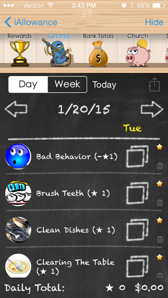
They’ve got their own corner of the app where we track their stars (earned or docked for behavior) and money (allowance, and stars converted to money).
The app has a bunch of pre-set chores you can select to track for each kid–at a frequency of your choosing.
(The spotting by the time is not from the app–that’s where the child’s name goes)
And you can add your own. (We added, “Make the bus on time”–everyone gets a star when that happens!)
You can set how many stars equate to a monetary amount, and then have the app make the transfer for you. We were paying our kids 10 cents a star, but we were doling out a lot of money! So we changed it to 5 cents a star.
You can also set up different accounts for each child. We have one for Church, one for Savings, and one for Spending. The Totals screen shows you all that, as well as Stars and Time (one of the few features I haven’t used in the app):
iAllowance is a really a great (and fun) app. It syncs via Dropbox or iCloud with an iPad. As a universal app, if you buy it, you can use it (and sync it) on any iOS device.
The kids love it, too. It’s been an effective motivator, and really fun for them to tap their stars at the end of the day–or tap on “Bad Behavior” and see a frowny face. 😦
Any time you tap next to a chore (which you can do in the Day view or Week view) you get an accompanying sound effect, too. And the allowance deposits happen automatically, in the amounts and to the accounts that you specify.
The app runs smoothly, and the developer is one of the most responsive (if not the most responsive) developers I’ve ever been in touch with.
I can’t say whether a incentive-based program will work for you and–if it will–whether you should run it from a mobile device. But I can say that both the overall setup of stars and allowance, as well as this particular app, have really helped perk up some listening ears around here!
Now… I’ve got to go give myself a star for posting another Apptastic Tuesday review, Blizzard 2015 notwithstanding.
Thanks to the developer of iAllowance for giving me a download for the review. Check out the app’s site here. You can find the full (paid) version here, and try the free version here.